December 13, 2025
Mastering Balance in Interior Design for Harmonious Spaces
Discover how to master balance in interior design. This guide explains symmetrical, asymmetrical, and radial balance with practical tips for any room.
Have you ever walked into a room and felt an immediate sense of calm and rightness, while another space just feels... off? The secret ingredient you're sensing is balance in interior design. Think of it as the invisible force that holds a room together, carefully arranging the visual weight of everything inside to create a feeling of stability.
The Foundation of Harmonious Living
Balance is far more than just a designer's buzzword; it's a core principle that makes a space feel good. It’s the art of distributing objects—from your sofa to a tiny vase—so that no single part of the room shouts for attention over the others. Imagine a perfectly balanced seesaw; that's the equilibrium we're aiming for.
When a room achieves this, it feels intentional and organized. This isn't just about looking pretty. The psychological effect is huge. A space with good visual flow can genuinely lower stress and make you feel more at ease. It's about creating an unspoken sense of order.
This doesn't mean everything has to be perfectly symmetrical. For instance, a heavy, dark-colored sofa on one wall can be beautifully offset by a pair of lighter armchairs and a tall lamp on the opposite side. Every piece has a job to do, contributing to a harmonious whole.
Why Balance Matters Today
The human need for balanced spaces is nothing new. Take the 1990s, for example, which saw a major shift towards minimalism. Balance then was all about "less is more," using clean lines and neutral colors to bring a sense of order to smaller city apartments. In fact, studies have shown that well-organized, clutter-free environments can cut stress levels by up to 20%. You can explore more historical design trends over at Mosaics.co.
Ultimately, getting a handle on balance is what turns a random collection of stuff into a real home. It's a foundational skill that helps you build rooms that are not just visually appealing but truly restorative. Getting these basics down is your first step. To go deeper, you can explore our full guide on core design concepts.
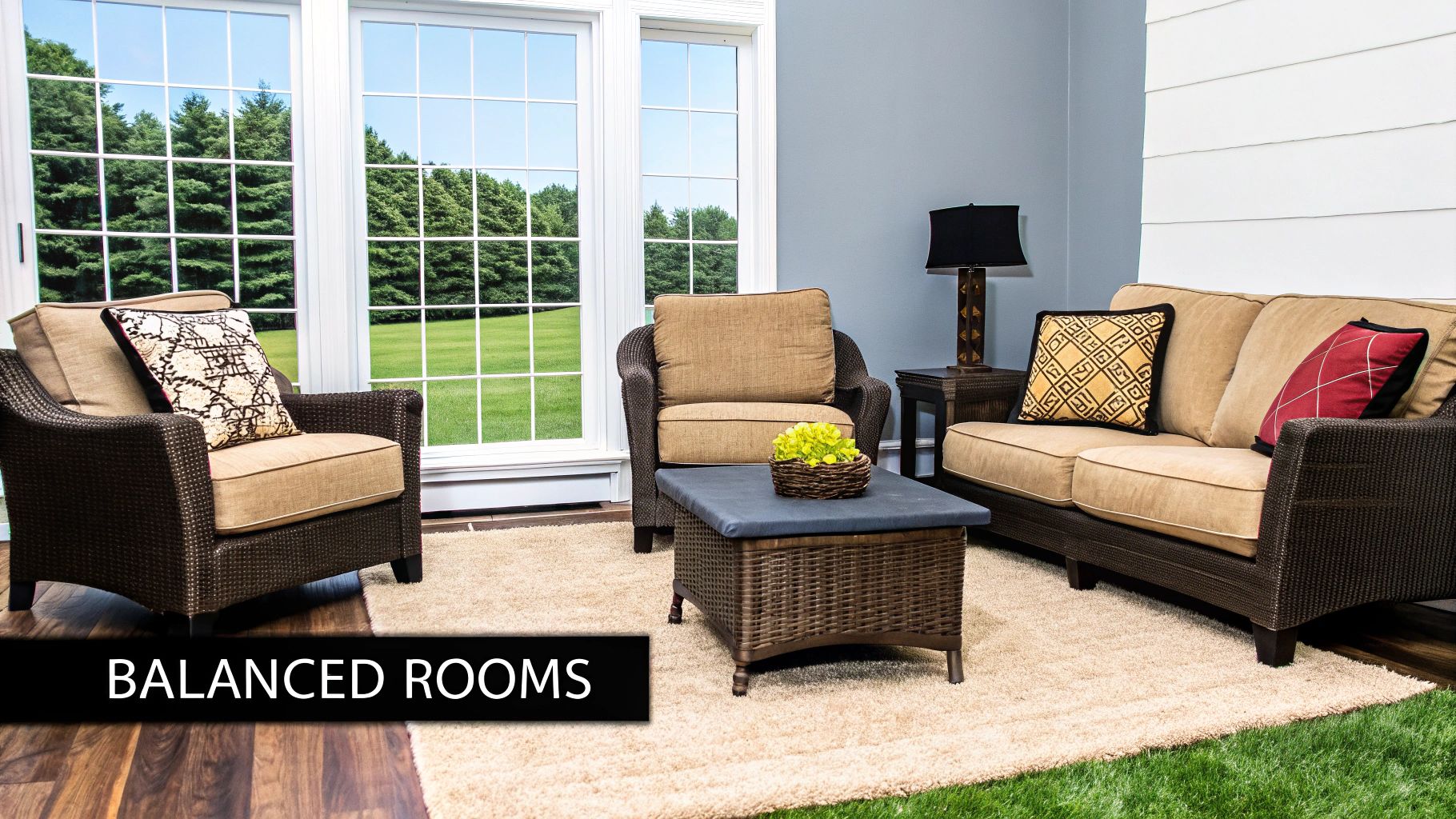
A room without balance can feel unsettled and visually noisy. By thoughtfully distributing visual weight, you create a silent conversation between objects that results in a calm and cohesive atmosphere.
The Three Foundational Types of Balance
To get a grip on balance in interior design, it helps to think of yourself as a director staging a scene. Your job is to arrange all the "actors"—furniture, decor, architectural details—so the final picture feels intentional and right. There are three classic "scripts" you can follow to pull this off: symmetrical, asymmetrical, and radial balance.
Each one sets a completely different mood and directs how you move through a room. Getting to know them is the key to moving from just placing furniture to creating a truly designed space. Let's break them down.
Symmetrical Balance: The Mirror Effect
Symmetrical balance is the most traditional and formal of the bunch. It’s all about creating a mirror image. You draw an invisible line down the center of a space and arrange identical (or very similar) objects on either side. It’s the classic living room with matching sofas facing each other over a coffee table, or a bedroom with two identical nightstands and lamps flanking the bed.
This approach is predictable in the best way—it creates a powerful sense of order, stability, and calm. Because it's so structured, it often brings a feeling of elegance and formality to a room. If you're looking to explore this timeless technique further, you can dive into our detailed guide on symmetrical balance.
Asymmetrical Balance: The Art of Equilibrium
Asymmetrical balance is more dynamic, relaxed, and modern. Instead of a perfect mirror image, it achieves harmony by balancing objects with similar visual weight, even if they aren't the same shape or size. Think of a seesaw: you can balance a big rock on one end with a few smaller rocks on the other.
In a living room, this might mean balancing a large sectional on one side with two smaller armchairs and a floor lamp on the opposite side. A gallery wall is another perfect example, where a mix of large, medium, and small frames are arranged to feel unified without being a carbon copy. This style takes a bit more of an intuitive eye, but the result is a space that feels more lived-in, layered, and visually exciting.
This diagram helps visualize how balance isn't just about looks—it's about creating a space that feels stable, cohesive, and genuinely good to be in.

As you can see, getting the balance right is foundational to designing a home that feels both put-together and psychologically comforting.
Radial Balance: The Central Anchor
Lastly, we have radial balance. This is where everything in the room is organized in a circle around a central focal point. All elements either radiate outward from this anchor or draw your eye inward toward it. It’s a powerful way to make an immediate statement.
A few common examples include:
- A round dining table with chairs spaced evenly around it.
- A grand entryway with a show-stopping chandelier hanging directly above a central table.
- A cozy conversation pit where armchairs are grouped around a large, round ottoman.
Radial balance is less common for an entire room, but it creates an incredibly dramatic and unifying effect when used for a specific zone or purpose. It's a real showstopper.
To help you quickly see the differences, here’s a simple breakdown of the three types.
Comparing The Three Types Of Balance
| Type of Balance | Visual Effect | Common Use Cases |
|---|---|---|
| Symmetrical | Formal, orderly, stable, and calm. | Traditional living rooms, bedrooms, formal dining rooms, entryways. |
| Asymmetrical | Dynamic, casual, interesting, and modern. | Family rooms, creative spaces, offices, gallery walls. |
| Radial | Dramatic, unifying, and attention-grabbing. | Dining areas, entry foyers, large seating arrangements. |
Once you understand these three foundational types, you have the toolkit to analyze why some rooms feel "off" and others just feel "right." Each offers a different strategy for achieving that perfect sense of harmony that defines great design.
Mastering the Elements of Visual Weight
Achieving balance in interior design is a bit like becoming a great chef. First, you learn the core recipes—like symmetrical and asymmetrical layouts—but then you have to truly master the ingredients. In the world of design, our ingredients are the elements that give an object its visual weight.
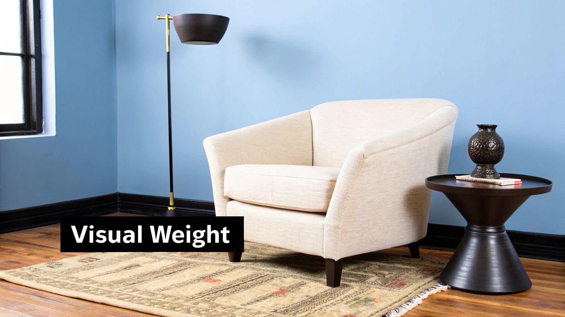
What’s visual weight? It's the perceived "heaviness" an item carries, which has very little to do with how much it actually weighs. It’s all about an object's power to grab your attention. Some pieces just naturally draw the eye more than others, and learning to feel that out is the secret to creating truly sophisticated, balanced rooms.
Color and Contrast
Color is hands down one of the most powerful tools you have for manipulating visual weight. Darker, bolder, and more saturated colors feel much heavier than light, pale ones. Just think about it: a small, dark navy accent chair can easily hold its own and balance out a much larger, cream-colored sofa.
- Dark Hues: Anything in black, charcoal, or a deep jewel tone will feel substantial and grounded.
- Bright Hues: A pop of vibrant color, like a single red cushion on a neutral couch, has a surprisingly strong visual pull. It acts as a small but mighty counterbalance.
- Light Tones: Pastels and soft neutrals feel airy and light, meaning you need more physical mass to balance a smaller, darker object.
This dance between color and weight is where the magic happens. It’s what lets you build an asymmetrical room that feels perfectly harmonious because you’re balancing visual impact, not just physical size.
Visual weight is simply the measure of an object's ability to attract the eye. A large, neutral piece and a small, vibrant one can achieve perfect equilibrium because they command equal attention.
Texture and Pattern
Next up is texture, which adds another layer of perceived heaviness. A rough, complex surface feels weightier than a smooth, glossy one because it engages our senses on a deeper level and creates tiny, intricate shadows.
A heavily textured, hand-knotted wool rug, for example, has far more visual weight and does a better job of anchoring a space than a sleek, low-pile synthetic one. It's the same reason a coarse linen pillow appears more substantial than a smooth silk one of the exact same size.
Patterns work the same way. A bold, intricate pattern demands more attention and therefore feels heavier than a solid block of color. You can really dive into this idea by exploring how to build depth in design.
Size and Shape
This one might seem obvious, but it’s foundational: larger objects have more visual weight. But don’t overlook shape. A complex, irregular form—like a live-edge coffee table or a sculptural floor lamp—is far more visually demanding than a simple square or circle.
These intricate shapes require more mental energy to process, which makes them feel more significant in a room. This is exactly why a single, uniquely shaped armchair can effectively balance a simple, straight-lined loveseat.
Once you get a feel for these four elements—color, texture, size, and shape—you gain the confidence to mix and match objects in ways that just feel right.
How Balance Shaped Iconic Design Eras
The idea of creating harmony in a room isn't some new-age trend; it's the invisible hand that has shaped great design for centuries. When we look back, we can see how the concept of balance in interior design has evolved, proving just how essential it is. One of the best examples of this in action is the Mid-Century Modern era—a true masterclass in blending form, function, and equilibrium.
Born from the optimism of the post-war years, this style championed clean lines, organic curves, and a genuine appreciation for materials. It was a direct answer to a world in flux, where families needed homes that were as practical as they were beautiful. This led to spaces that felt open and deeply connected to nature, yet remained perfectly grounded and orderly.
Mid-Century Modern and Functional Harmony
Mid-Century Modern design perfectly walked the line between stunning aesthetics and the real-world demands of a growing family. The furniture wasn't just sculptural art; it was built for daily life and comfort. This was also when open-plan living really took off, knocking down walls to create a seamless flow between kitchen, dining, and living areas.
Of course, a layout like that demands a thoughtful approach to balance. Designers of the era relied on a few key techniques:
- Asymmetrical Arrangements: Instead of perfect mirror images, they grouped furniture into functional zones that felt connected yet distinct. A large sofa, for instance, could be balanced by a low-slung credenza and a statement armchair.
- Material Contrast: Warm woods like teak and walnut were often set against new materials like plastic, metal, and glass. This created a textural balance that was simultaneously warm and sleek.
- Integration with Nature: Huge windows and sliding glass doors blurred the line between inside and out, balancing the clean, man-made interior with the wild, organic shapes of the landscape.
A Legacy of Balanced Design
The focus on functional harmony during this period completely changed the game. As American families embraced open floor plans in the mid-20th century, iconic pieces like the Eames Lounge Chair became symbols of this new, balanced way of living. The style cleverly balanced soft, muted color palettes with the strong, clean geometry of the furniture.
Its influence is still everywhere. Recent surveys show that a staggering 72% of interior designers point to Mid-Century Modern as a major source of inspiration for creating visual and spatial harmony. You can learn more about historical design trends and their lasting impact.
The timeless appeal of Mid-Century Modern comes from its core belief: a home can be an efficient machine for living and a serene, beautiful sanctuary. That perfect balance is what makes it feel just as relevant today.
This look back at history makes it clear that achieving balance in interior design is about so much more than just where you put the sofa. It’s about creating spaces that truly reflect and support the way we want to live.
Achieving Balance in Every Room of Your Home
Alright, this is where the theory gets real and the fun truly begins. Applying the principles of balance in interior design isn't about memorizing a rigid rulebook. It's about learning the strategies so you can adapt them to the unique personality and function of each space in your home.
Let’s get practical and translate these big ideas into real-world blueprints for your most important rooms.
From a buzzing, social living room to a quiet, restful bedroom, every area has its own job to do. Our goal is to create a sense of equilibrium that actually supports that job—whether it’s encouraging lively conversation or inviting deep relaxation.
The Living Room: Creating Conversational Balance
The living room is the social hub of the home, so it needs to have an effortless flow that encourages people to gather and talk. A well-balanced layout here feels instantly welcoming and makes interaction easy, all without feeling crammed or chaotic.
If you’re aiming for a formal, classic vibe, symmetrical balance is your best friend. Picture a grand fireplace as the room's anchor. You could flank it with two identical sofas, or place one sofa directly across from a perfectly matched pair of armchairs. The result is an immediate sense of order and sophisticated elegance.
But let's be honest, most of us live a little more casually. For modern living, an asymmetrical approach often feels more natural and relaxed. The trick isn't to mirror objects, but to balance their visual weight. Think of it like a seesaw with different-sized kids.
- Got a huge sectional sofa? Counterbalance it on the other side of the room with two smaller chairs and a stylish floor lamp. As a group, the chairs and lamp occupy a similar visual footprint as the sectional, creating harmony.
- What about the giant TV? Don't just stick it on the wall. Integrate it into a thoughtful arrangement. Mount it over a long, low console, then balance its dark, heavy presence with a tall fiddle-leaf fig on one side and a curated stack of coffee table books on the other.
This kind of dynamic layout just feels more organic and adaptable to the beautiful mess of everyday life.
The Bedroom: Designing for Serene Symmetry
When you walk into your bedroom, you want to feel your shoulders drop. The goal here is pure rest and tranquility, which makes symmetrical balance the undisputed champion for creating a calm, orderly sanctuary. There's something inherently stable and predictable about symmetry that sends a subconscious signal to our brains telling us it's time to unwind.
The bed is always the star of the show. You can build a wonderfully serene composition around it by placing identical nightstands with matching lamps on either side. This simple mirrored setup creates a powerful sense of visual quiet. To nail the look, hang one large piece of art centered directly above the headboard.
The bedroom is the one room where predictability is a virtue. Symmetrical balance provides a soothing, visual structure that helps quiet the mind and promote a sense of deep calm and restfulness.
The Dining Room: The Social Centerpiece
The dining room is a fantastic place to play with different types of balance, depending entirely on the atmosphere you're trying to cultivate. Your first clue? The shape of your table.
A round or square table practically begs for radial balance. By arranging chairs evenly around this central point, you create a natural focal point that pulls everyone together. Suspend a statement chandelier right over the center of the table to reinforce this effect, making the whole space feel intimate and unified.
On the other hand, if you have a long, rectangular table or a more casual dining nook, asymmetrical balance can inject some serious personality. Instead of a formal set of matching chairs, try placing a long bench on one side and individual chairs on the other. This simple swap breaks up the monotony and gives the room a cool, modern, and laid-back charm.
Your Practical Checklist for a Balanced Home
Theory is great, but the real test is applying it to your own space. This checklist isn’t about following rigid rules; think of it as a guide to help you see your rooms with fresh eyes and make changes that feel right. It’s a simple process for auditing what you have and tweaking it for a more harmonious feel.
Let's walk through the steps that will help you finally create that elusive sense of equilibrium, turning a chaotic space into a calm one.
Start with a Strong Focal Point
Every well-balanced room has an anchor. It's the first thing that catches your eye and gives the space a sense of purpose. Without one, your gaze just wanders, and the room feels jumbled. Your first job is to either find or create this anchor.
- Look for Architectural Features: Do you have a fireplace, a big picture window, or some great built-in shelves? If so, congratulations—your focal point is already there. Your task is simply to arrange the furniture to celebrate it.
- Create Your Own Statement: If your room is more of a blank canvas, you get to create the main event. This could be a large piece of art, a dramatic headboard, an accent wall in a bold color, or even a stunning light fixture. Just place it where you want everyone to look first.
Once you have that centerpiece, everything else in the room should play a supporting role, not try to steal the spotlight.
Distribute Visual Weight Evenly
Okay, now for a classic designer trick: stand back and squint your eyes. Does one side of the room feel noticeably "heavier" than the other? This is where you put your understanding of visual weight into practice. You're aiming for either a perfectly mirrored symmetrical layout or a more casual, dynamic asymmetrical one.
- Assess the Big Stuff: Start with your largest pieces—the sofa, the bed, hefty cabinets. Are they all crammed onto one side? If so, it's time to start shifting things around.
- Use Counterbalancing: Can't move that giant sectional? No problem. You can still balance it. A large, dark sofa on one side can be offset by a pair of lighter-colored armchairs and a floor lamp on the opposite side.
- Spread Out Color and Texture: Try not to group all your dark, heavy pieces or all your bright, eye-catching decor in one corner. Sprinkling them throughout the space will create a much more even and pleasing visual flow.
Vary the Heights of Your Objects
A room where everything is at the same height can feel incredibly monotonous and flat. Balance isn't just about left and right; it's also about up and down. Creating a varied "skyline" with your furniture and decor adds rhythm and keeps the eye moving around the room.
A common design mistake is creating a single "horizontal line" where all the furniture tops are roughly the same height. Breaking this line with objects of different sizes is one of the fastest ways to make a space feel professionally styled.
To fix this, make sure you have a good mix of heights:
- High: Think tall floor lamps, high-backed armchairs, towering houseplants like a fiddle-leaf fig, or vertically oriented artwork.
- Medium: This is where most of your seating, console tables, and desk lamps will naturally fall.
- Low: Coffee tables, ottomans, and low-slung media units fit here.
When you ensure you have elements in all three of these height categories, you instantly create a more engaging and well-balanced composition.
Feeling stuck trying to picture all these changes? It's one thing to read about balance, but it's another thing entirely to see it in your actual room. With a tool like AiRoom, you can stop guessing and start seeing. Just upload a photo of your space to generate different balanced layouts, play with new focal points, and test furniture arrangements without lifting a finger. Get the perfect balance right the first time by visiting their website to start designing.